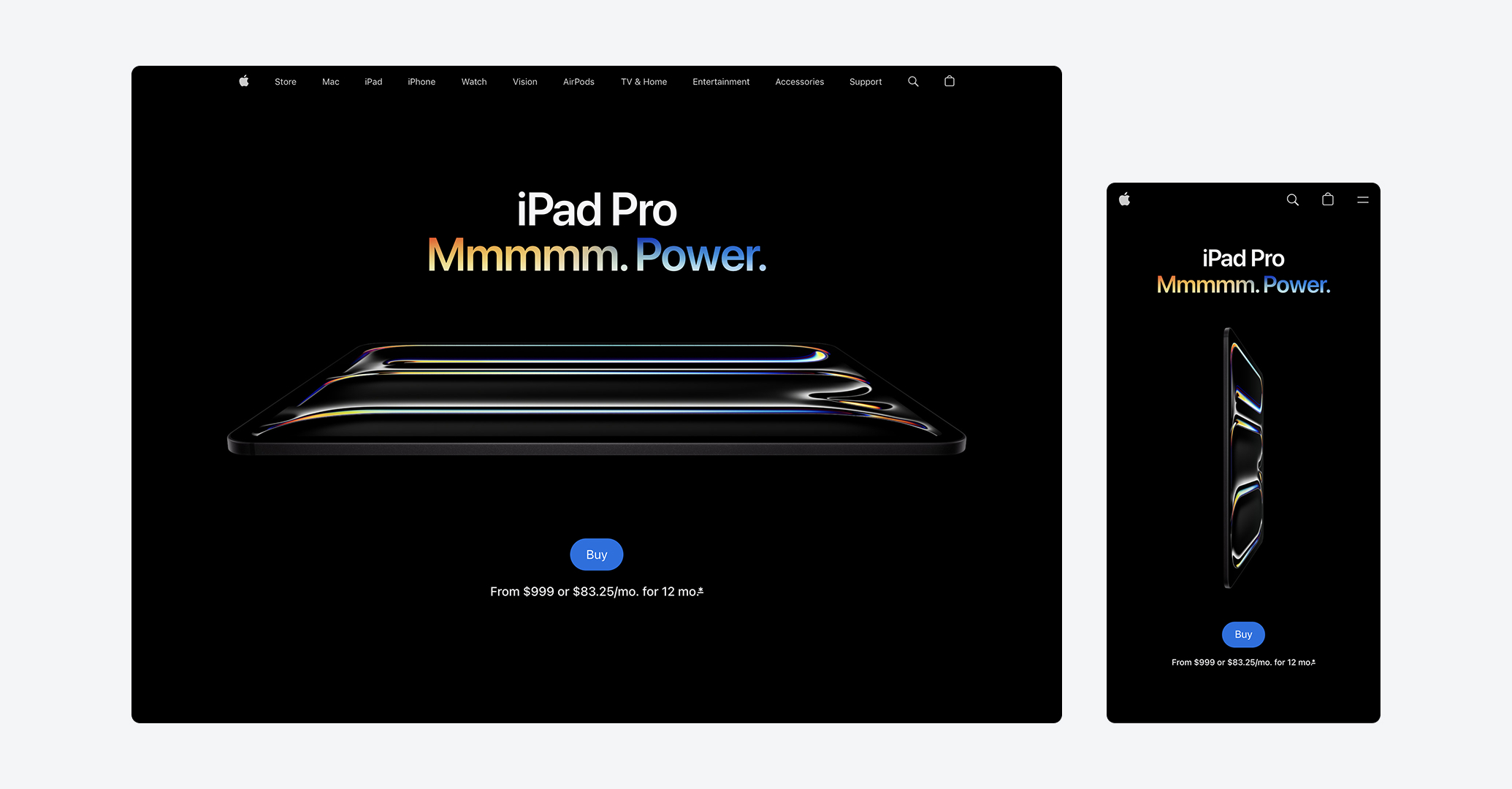
Typography is an essential element in a website, not just a static one but rather a living system that behaves differently across different screen sizes. Unlike images, text doesn't simply scale.
I was improving my portfolio's typography by defining all the styles I use, unifying them, and making them easier to modify later. It turned out to be a rather confusing task, since Figma handles font sizes in a more rigid way compared to the flexibility available in code.
Each website eventually needs to have consistent typography styles that give the ability to adjust the styles easily while maintaining the same class name for each text element. Initialized the task by laying out all the breakpoints in a Figma file, then defined five size variants for every text style, one per breakpoint.
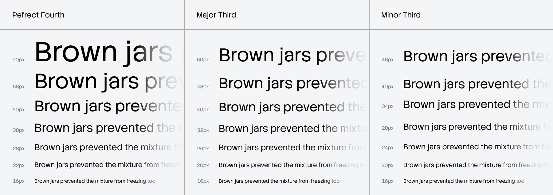
The approach I took to ensure a smooth responsive expression was choosing multiple typography scaling systems (see Typescale). Perfect Fourth scale for the largest breakpoint, Minor Third for the smallest breakpoint, and finally Major Third for the breakpoints in between. Following this would solve the issue of crumbling text on smaller screens by adapting the sizes to the screen size. At this stage, everything looked good in Figma.
While images in Figma can respond to artboard resizing, typography does not; this is where Figma's rigidity becomes clear. CSS provide a feature I was trying to avoid because it felt hard to grasp: clamp(). Before committing to it, I almost went down the path manually adding every value I had defined in Figma variables. Once the first two styles were implemented, it was clear that this was the wrong direction. Taking a step back was necessary, since everyone recommends using clamp(), it was time to delve into it. With clamp(), defining responsive text sizes per style boils down to a single line:
--font-size-xl: clamp(min_value, ideal_value, max_value)
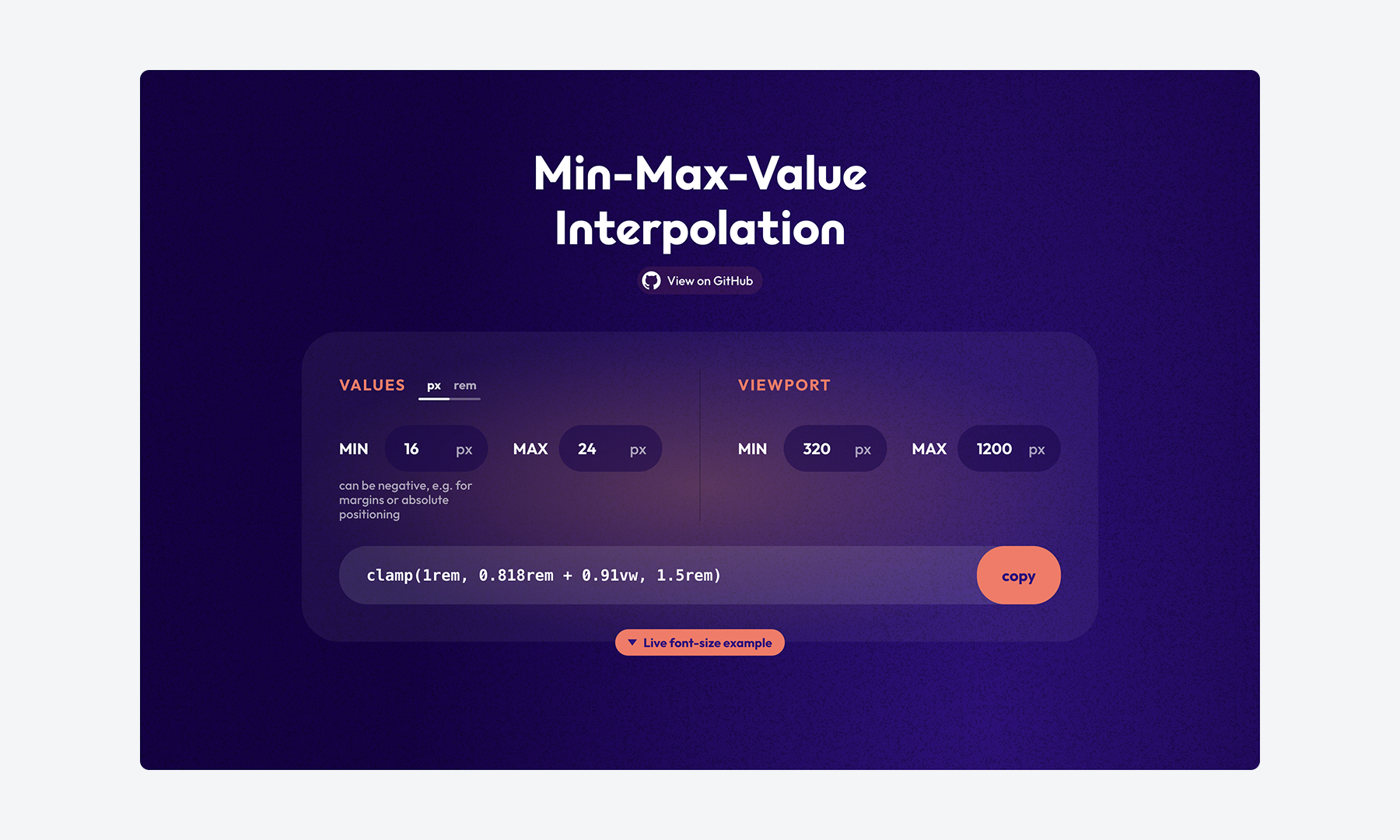
Using clamp() allowed me to reduce each text style from five breakpoint-specific sizes down to just two values: a minimum, and a maximum. The ideal_value defines how the property scales in normal conditions, typically using vw or a calc() expression. The only challenge was figuring out how to calculate the ideal_value, within quick research I came across a helpful tool Min-Max-Value-Interpolation, which does exactly that. By providing the smallest and largest breakpoints along with the minimum and maximum values for each text style. In result, you get a ready to use clamp().
With responsive typography in place, there's another challenge I needed to fix. Each typeface has a different baseline and cap height, making vertical alignment tricky. Text often requires hard-coded padding on each edge to appear vertically centered. Even when responsive values are added across breakpoints, the misalignment becomes more noticeable, turning true alignment into a tedious cycle of fine-tuning values.
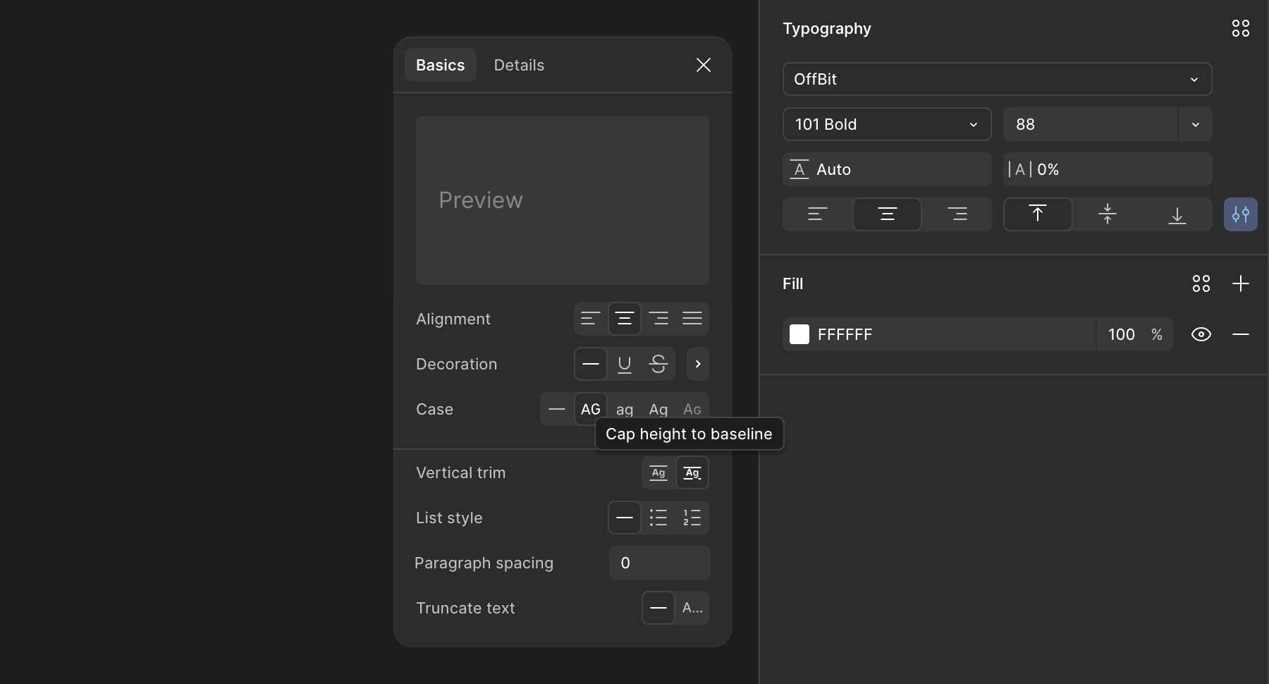
Figma already had a solution for this issue Vertical Trim. Fortunately, CSS has introduced text-trim feature in early-2025, and I was surprised by how widely supported it already was across different browsers. text-trim in CSS provides even more advanced capabilities than Figma, though I won't go into the details here.
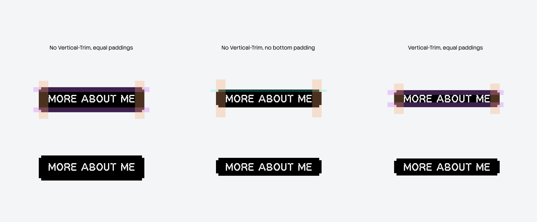
We should be mindful of where text-trim should be applied. Using it alongside text with different typeface can disrupt the overall visual balance. On my website, I chose to apply it specifically to buttons and tags, as these elements are isolated and contain a single text style, making them a safe and predictable place to use it.